多种方式实现居中
「实现居中」也是一道必考题,看下代码
html
<style>
.wp {
border: 1px solid red;
width: 300px;
height: 300px;
}
.box {
background: green;
}
.box.fixed-size {
width: 100px;
height: 100px;
}
</style>
<body>
<div class="wp">
<div class="box fixed-size">text</div>
</div>
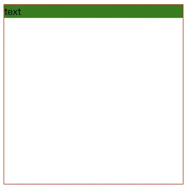
</body>如图:如何让绿色的块水平垂直居中呢?
仅适用于居中元素定宽高
absolute + 负 margin
绝对定位的百分比是相对于父元素的宽高,使得元素偏移后,在修正元素自身宽高的一半就行
css
.wp {
  position: relative;
}
.box {
  position: absolute;
  top: 50%;
  left: 50%;
  margin-left: -50px;
  margin-top: -50px;
}
absolute + margin auto
这种方式将设置各个方向的距离都是 0,此时配合 margin 为 auto,就可以在各个方向上居中了
css
.wp {
  position: relative;
}
.box {
  position: absolute;
  top: 0;
  left: 0;
  right: 0;
  bottom: 0;
  margin: auto;
}
absolute + calc
此种方法和第一种类似,不再展开
css
.root {
  position: relative;
}
.textBox {
  position: absolute;
  top: calc(50% - 50px);
  left: calc(50% - 50px);
}
居中元素不定宽高
对于居中元素不定宽高的情况,依然也有很多方法
javascript
<style>
  .wp {
  border: 1px solid red;
  width: 300px;
  height: 300px;
}

.box {
  background: green;
}
</style>
<div class="wp">
  <div class="box">text</div>
</div>
absolute + transform
不定宽高时,利用 CSS3 新增的 transform,transform 的 translate 属性也可以设置百分比,这个百分比是相对于自身的宽和高,因此可以将 translate 设置为 -50%
原理和第一种方法也类似
css
.wp {
  position: relative;
}
.box {
  position: absolute;
  top: 50%;
  left: 50%;
  transform: translate(-50%, -50%);
}
lineheight
把 box 设置为行内元素,通过 text-align 也可以做到水平居中,同时通过 vertical-align 做到垂直方向上的居中,代码如下
这个方法充分利用了行内 / 块级元素的特点
css
.wp {
  line-height: 300px;
  text-align: center;
  font-size: 0px;
}
.box {
  font-size: 16px;
  display: inline-block;
  vertical-align: middle;
  line-height: initial;
  text-align: left; /* 修正文字 */
}
table
其实历史上 table 经常被用来做页面布局,这么做的缺点是会增加很多冗余代码,并且性能也不友好
css
.wp {
  text-align: center;
}
.box {
  display: inline-block;
}
css-table
如何使用 table 布局的特性效果,但是不采用 table 元素呢?
答案是 css-table
使用了 display: table-cell,同时和 table 布局相比,减少了很多冗余代码
css
.wp {
  display: table-cell;
  text-align: center;
  vertical-align: middle;
}
.box {
  display: inline-block;
}
flex
flex 是非常现代的布局方案,只需几行代码就可以优雅地做到居中
css
.wp {
  display: flex;
  justify-content: center;
  align-items: center;
}
grid
grid 布局非常超前,虽然兼容性不好,但是能力超强
css
.wp {
  display: grid;
}
.box {
  align-self: center;
  justify-self: center;
}
总结一下
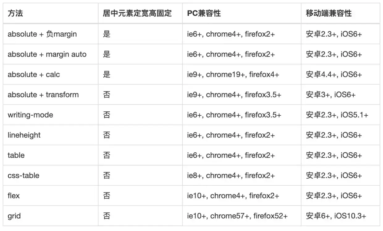
- PC 端有兼容性要求,宽高固定,推荐 absolute + 负 margin
- PC 端有兼容要求,宽高不固定,推荐 css-table
- PC 端无兼容性要求,推荐 flex
- 移动端推荐使用 flex
最后整理一个列表